
Photos: Charting Mets Uniforms Through Baseball Cards
Much to my surprise, the article I wrote a couple of weeks ago about the Mets having too many uniforms was one of my most popular ever. Who knew fans were so passionate about Mets uniforms?
I wanted to follow it up with a history of Mets uniforms, but since I am neither a historian nor a uniform expert, I was stymied. Then I realized a very simple way to do it — Topps baseball cards. They are issued every year and would show the evolution of the Mets uniforms.
Now, this is not an exact science. It is likely some pictures were taken the year before the card was issued. And I only used home uniforms, and as we all know, the Mets often have multiple home jerseys in any given year. But I still think it illustrates how Mets uniforms have changed over the years.
After I wrote the previous article which lauded the Mets throwback cream pinstriped jersey, several readers pointed out that those early Mets uniforms were not cream at all — they were white. Well, the cards show they were right. Still though, I like the cream.
Lastly, this little project got difficult when finding cards from the late 1990s through today (I found them all on eBay, by the way). Topps used to issue one set, but then they started issuing multiple sets of cards. Sometimes I didn’t even know what I was looking at!
In any case, here is a rough estimate of Mets uniforms over the years:
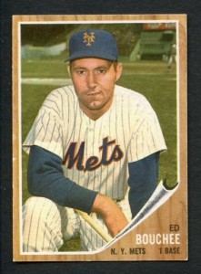
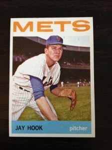
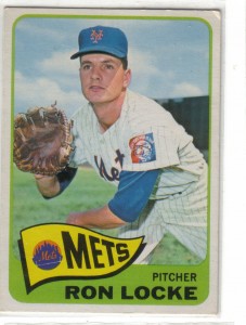
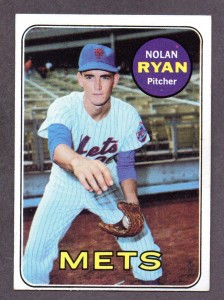
1960s


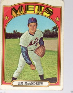
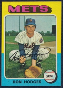
1970s


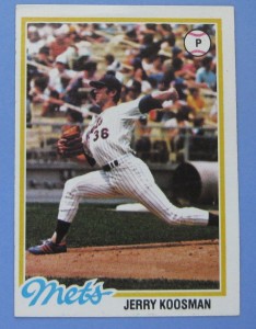
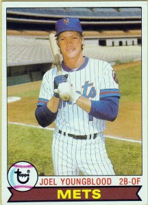
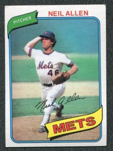
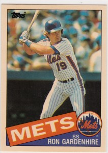
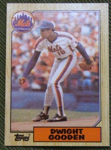
1980s


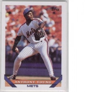
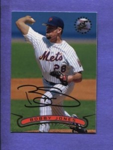
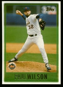
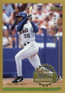
1990s


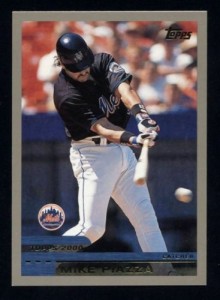
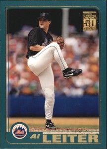
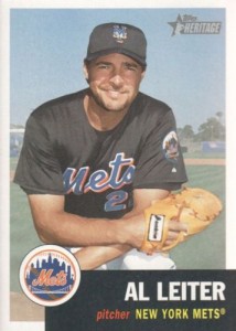
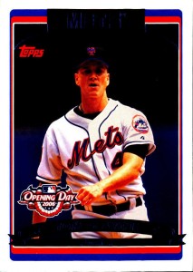
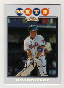
2000s


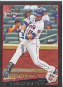
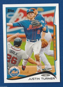
2010s


Pingback: Links to Read: In case you missed it… | Metsblog
Pingback: Links to Read: In case you missed it… - Breaking News, Rumors and Headlines - FourLeagues
Great idea!
While they seemed like a nice change at the time and we were winning, looking back the black is just awful.