Mets Have Best Logo in MLB?
Way back when, I used to drive past the World Trade Towers on my way to work. It never fazed me — I was passing two of the most recognizable buildings in the world and I didn’t think twice. I guess when you see something all the time, its significance escapes you, sometimes until someone points it out. Somehow this brings me to MLB logos.
I never thought twice about the Mets logo — it’s something I saw my entire life. But recently Jim Caple at ESPN.com ranked his favorite logos and he put the Mets logo first. I was surprised but then I realized, “Hey, it is a pretty classic logo.” I mean, it says it all — the name of the team, the city, the sport.
The best thing is that this has been the primary logo for the team’s entire history. There was a very minor change in 1999 — they took out a little “NY” just before “Mets.” But so many teams change logos as often as they change jockstraps. It is sometimes hard to keep track.
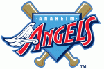
So I have listed my five favorite logos (in no particular order), the five worst, five classics that should come back, and five that never should have been designed in the first place. These are the team’s “primary” logos — teams often have secondary logos. The pictures come from Sportslogos.net, a great site if you like this sort of thing.
5 Best logos:
5 worst logos:

5 retired logos that should come back:


5 retired logos that should stay retired:



Pingback: Best Logos - ALL LOGOS – ALL LOGOS
Pingback: Best Logos - LOGO BOX – LOGO BOX